In today’s digital age, a website’s visual appeal can make or break its success. Whether you’re a budding website owner, developer, or content manager, understanding image formats and optimization is crucial to ensure a snappy and engaging user experience. In this beginner-friendly guide, we’ll walk you through the exciting world of web images, demystifying key concepts and helping you make smart choices to enhance your website’s performance.
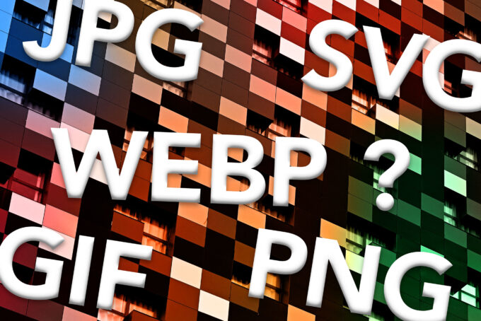
1. Image Formats: The ABCs
Let’s start with the basics: image formats. The two most common formats you’ll encounter on the web are JPEG and PNG. JPEGs are great for photographs and complex images, offering a good balance between quality and file size. On the other hand, PNGs excel at preserving image quality with transparent backgrounds, making them ideal for logos and graphics.
2. Transparency and GIFs
Transparency adds flair to your visuals. If you need transparency in your images, consider using PNGs or GIFs. GIFs are popular for simple animations, but if you require higher quality and better compression, PNG-24 is your go-to format.
3. Compression Magic
Compression is your best friend when it comes to fast-loading websites. JPEGs and PNGs can be compressed without a significant loss of quality. Tools like TinyPNG and ImageOptim on desktop and some Image Processor tools online can help you strike the perfect balance between image quality and file size.
4. Bit-Depth and Color Modes
For most web images, 8-bit PNGs (256 colors) and 24-bit PNGs (16.7 million colors) are sufficient. 8-bit PNGs are great for simple graphics, while 24-bit PNGs are perfect for detailed images with transparency.
5. Meet WebP and SVG
Enter the superheroes of modern image formats! WebP is a highly efficient format, offering excellent compression and quality. Use it for photos, illustrations, and animations. SVG (Scalable Vector Graphics) is the go-to choice for logos and icons, as it scales perfectly to any screen size.
6. TIFF and the Web
TIFF (Tagged Image File Format) is a heavyweight champion primarily used in professional photography. However, it’s unsuitable for the web due to its large file sizes. Opt for more web-friendly formats like JPEG, PNG, or WebP to ensure fast load times.
7. Crisp Images for All Screens
One crucial aspect of optimizing your website for responsive design is ensuring that your images look sharp and vibrant on all devices. To achieve this, aim for high-quality images with two different pixel densities: @2x for retina screens and @1x for regular monitors. This simply means that you should have the pixel dimensions of your image at double the actual displayed size.
Retina screens, found in many modern devices, have a higher pixel density, resulting in crisper and more detailed visuals. By including @2x images, you’ll cater to these screens and provide an enhanced viewing experience.
For regular monitors, @1x images are sufficient and won’t compromise loading speed. Striking the right balance between image quality and performance is key to delivering a top-notch experience to all your visitors.
8. Performance Matters
Remember, a fast-loading website keeps visitors engaged. Choose the right image format, compress intelligently, and optimize for responsiveness to deliver an exceptional user experience.
In conclusion, as a website owner, developer, or content manager, understanding image formats and optimization is essential. It’s like learning the alphabet of web design. By choosing the right formats, optimizing your images, and considering responsive design, you’ll ensure your website not only looks great but also performs at its best. So, dive in, get creative, and make your website shine!